Wedding Branding
Before you figure this out, it was for my wedding.
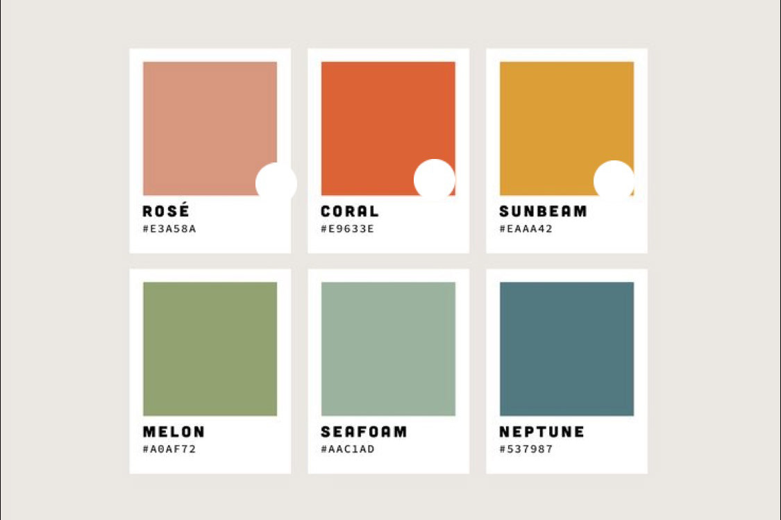
However, my partner and I had very high standards in curating peoples' experience at it, and we wanted to do something that felt like us. I curated various color schemes, narrowing to jewel tones, and helped my wife pick out the fonts that felt outdoorsy but not trite, elevated but not stuffy, and bright but not tacky.
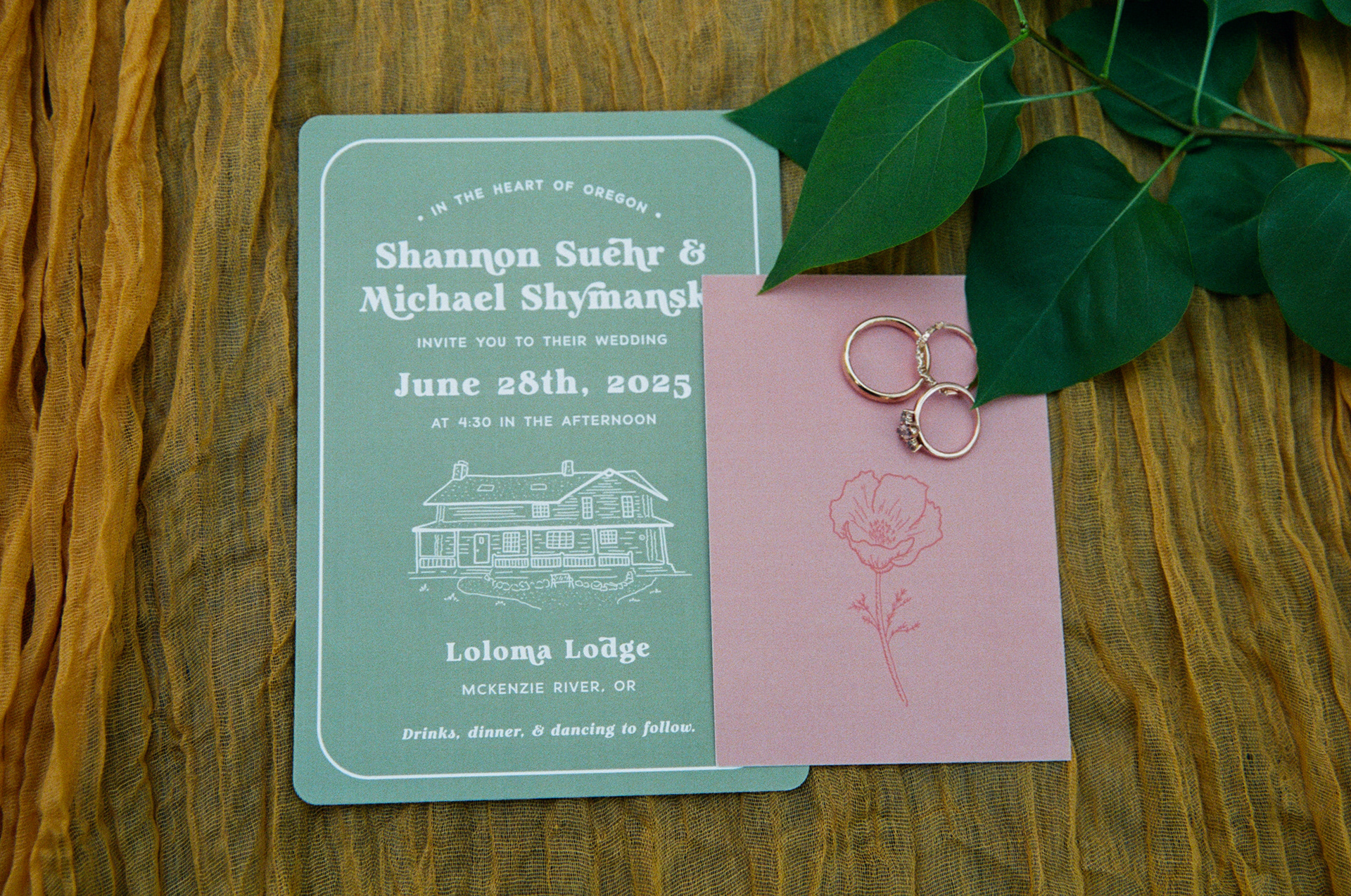
Many photos courtesy of Haley Busch.
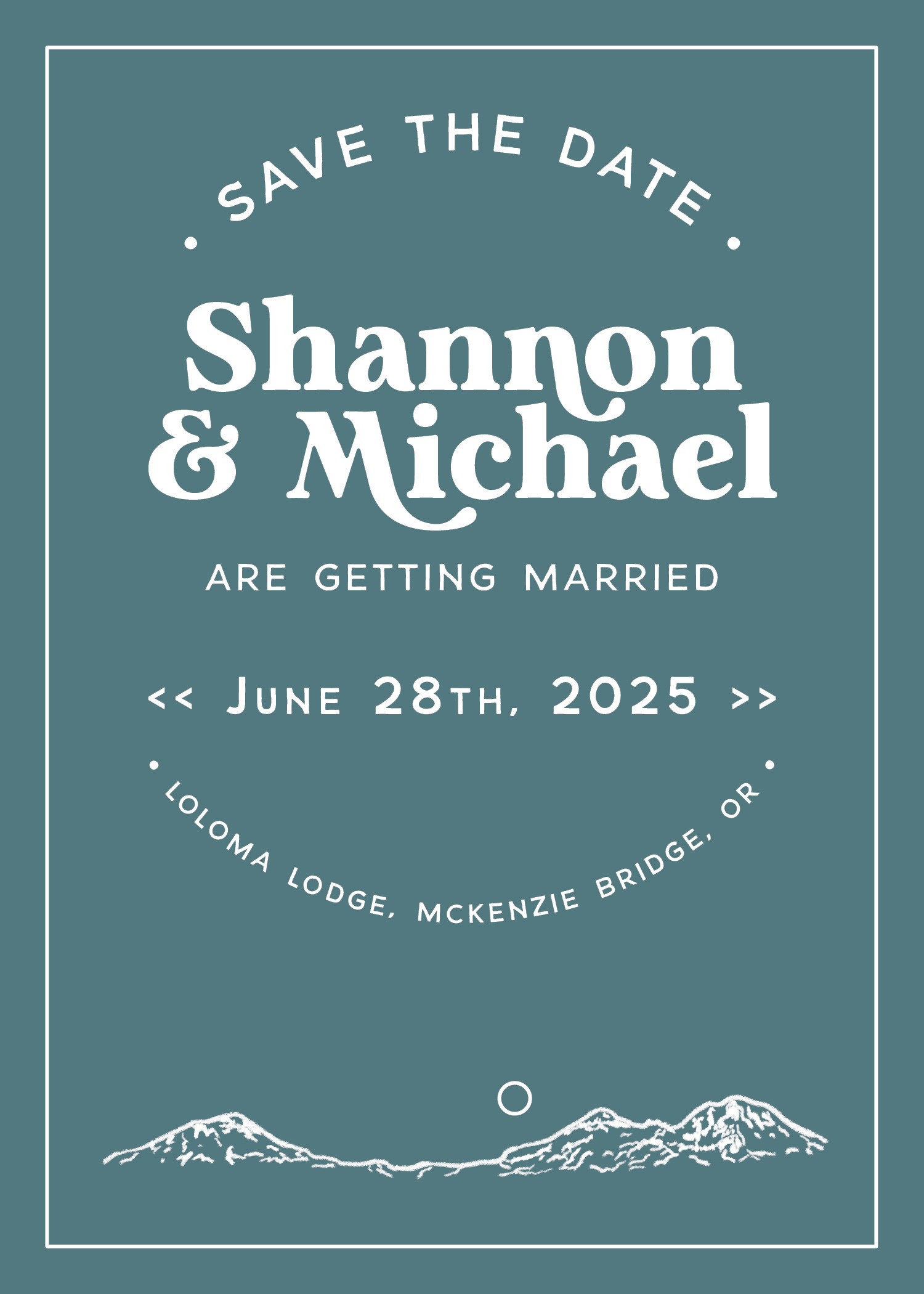
Save the Dates
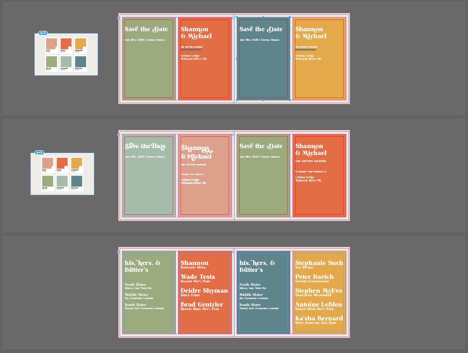
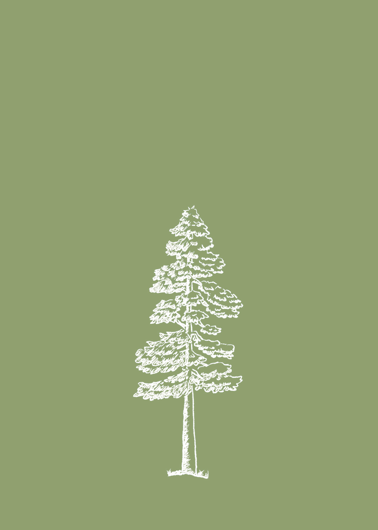
Our first touchpoint, I illustrated the Three Sisters and put together several designs for our save the dates with our selected fonts and color palette.
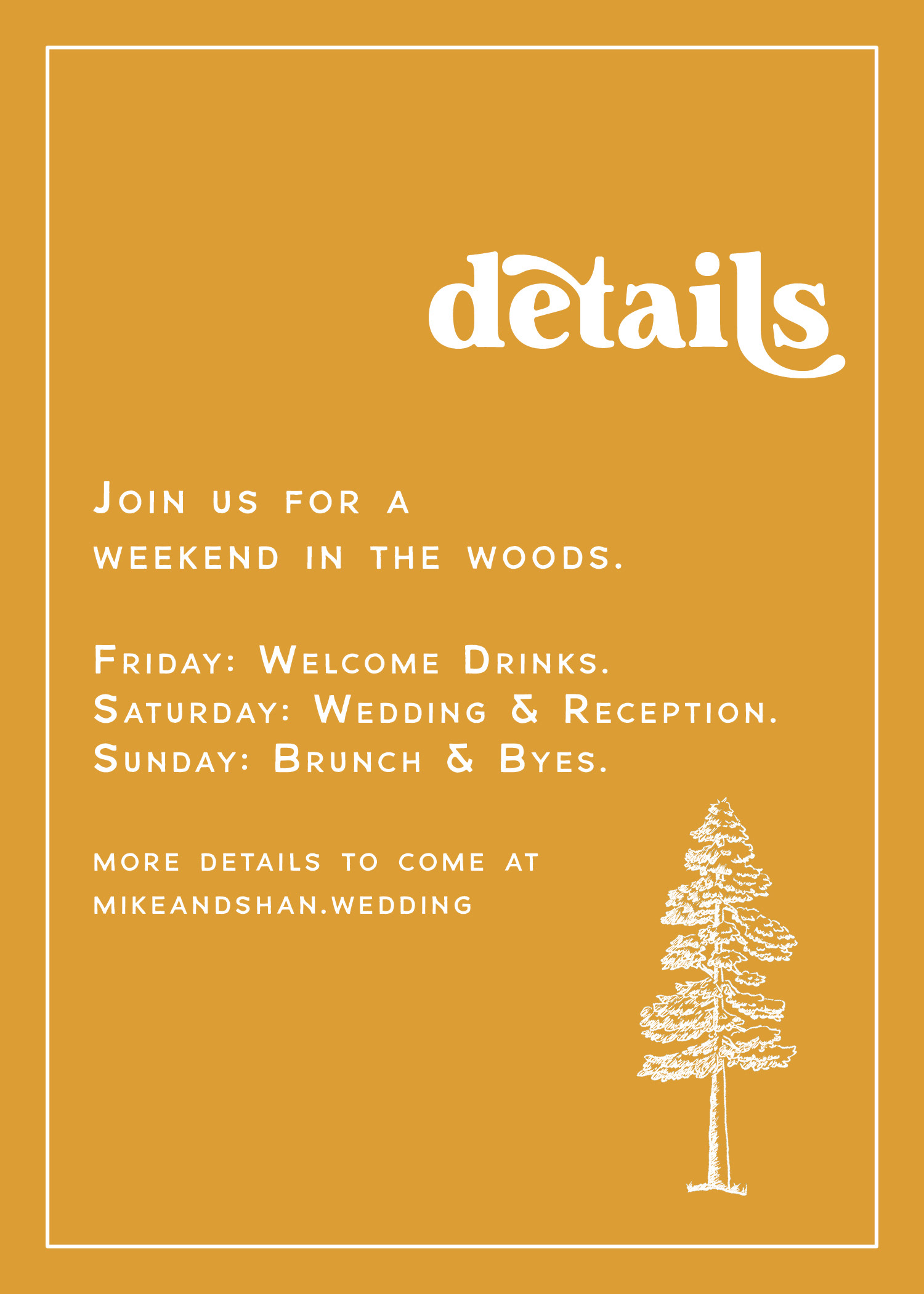
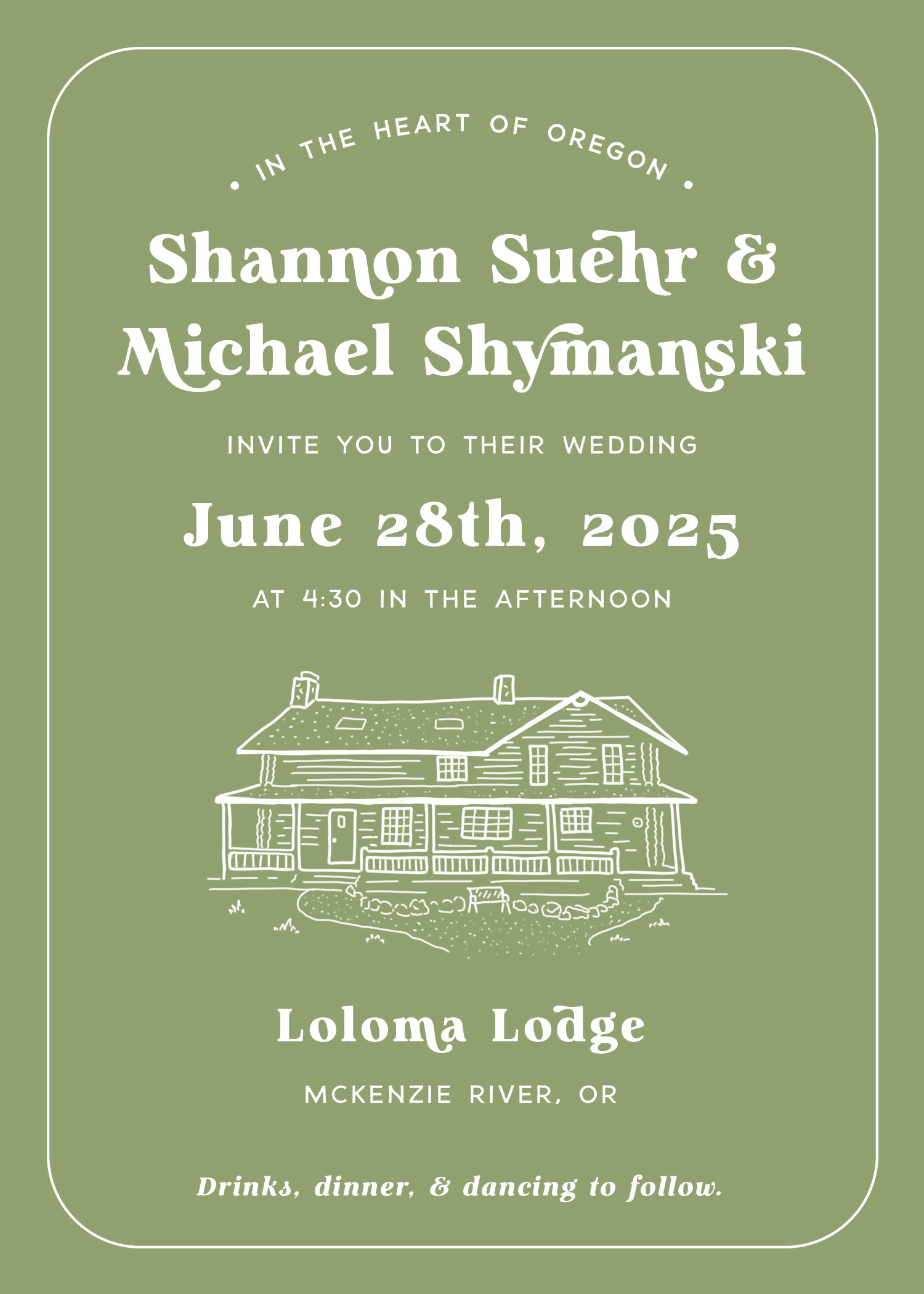
Invitations
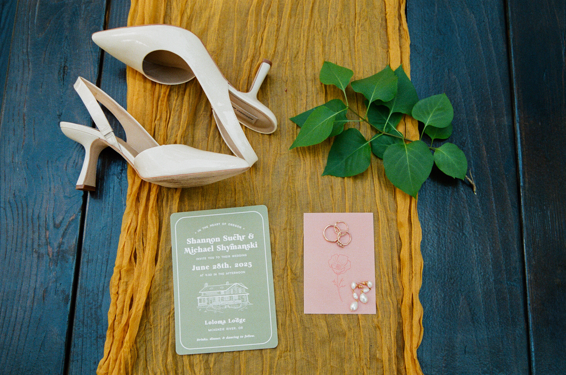
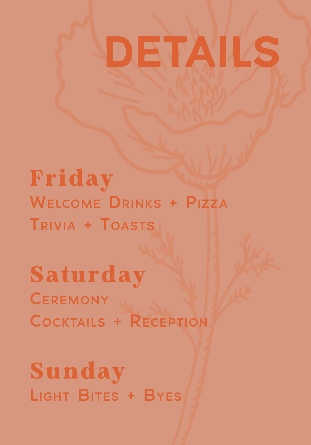
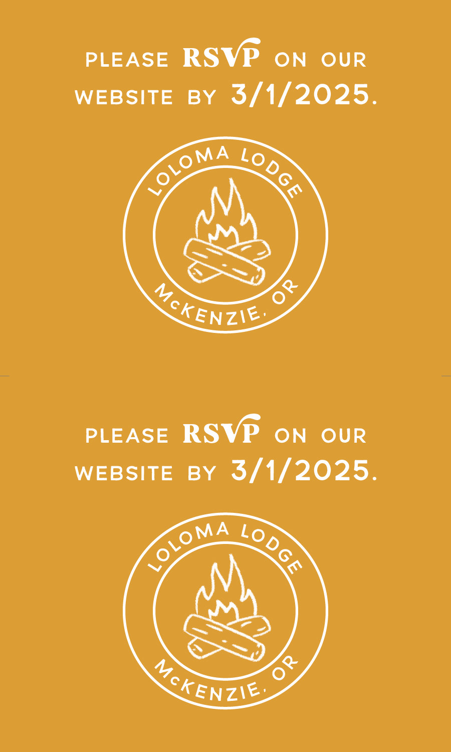
After, my wife wanted a three-part invitation, and I created more assets and layouts for a cohesive and comprehensive invitation.
Illustrations:
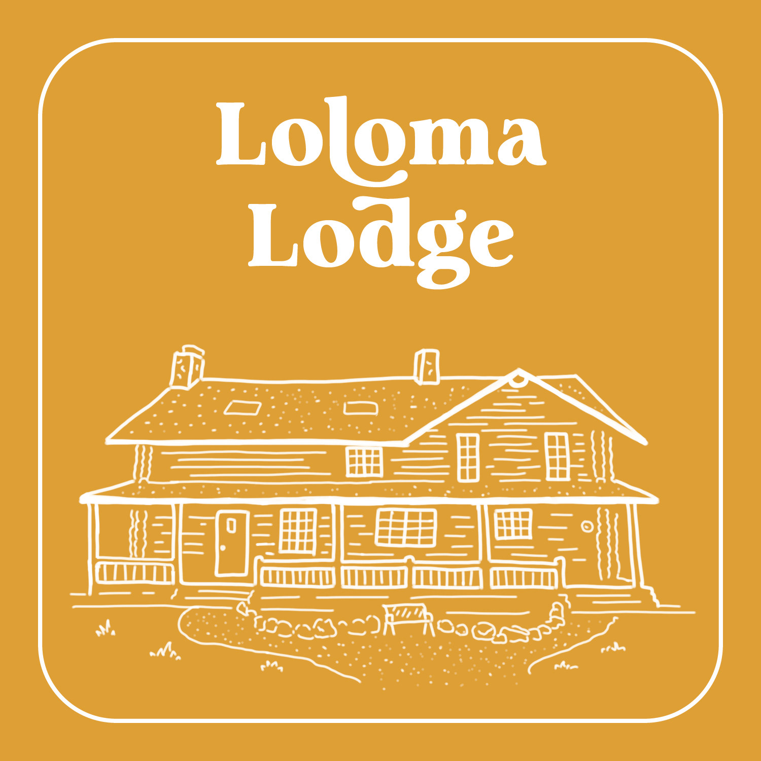
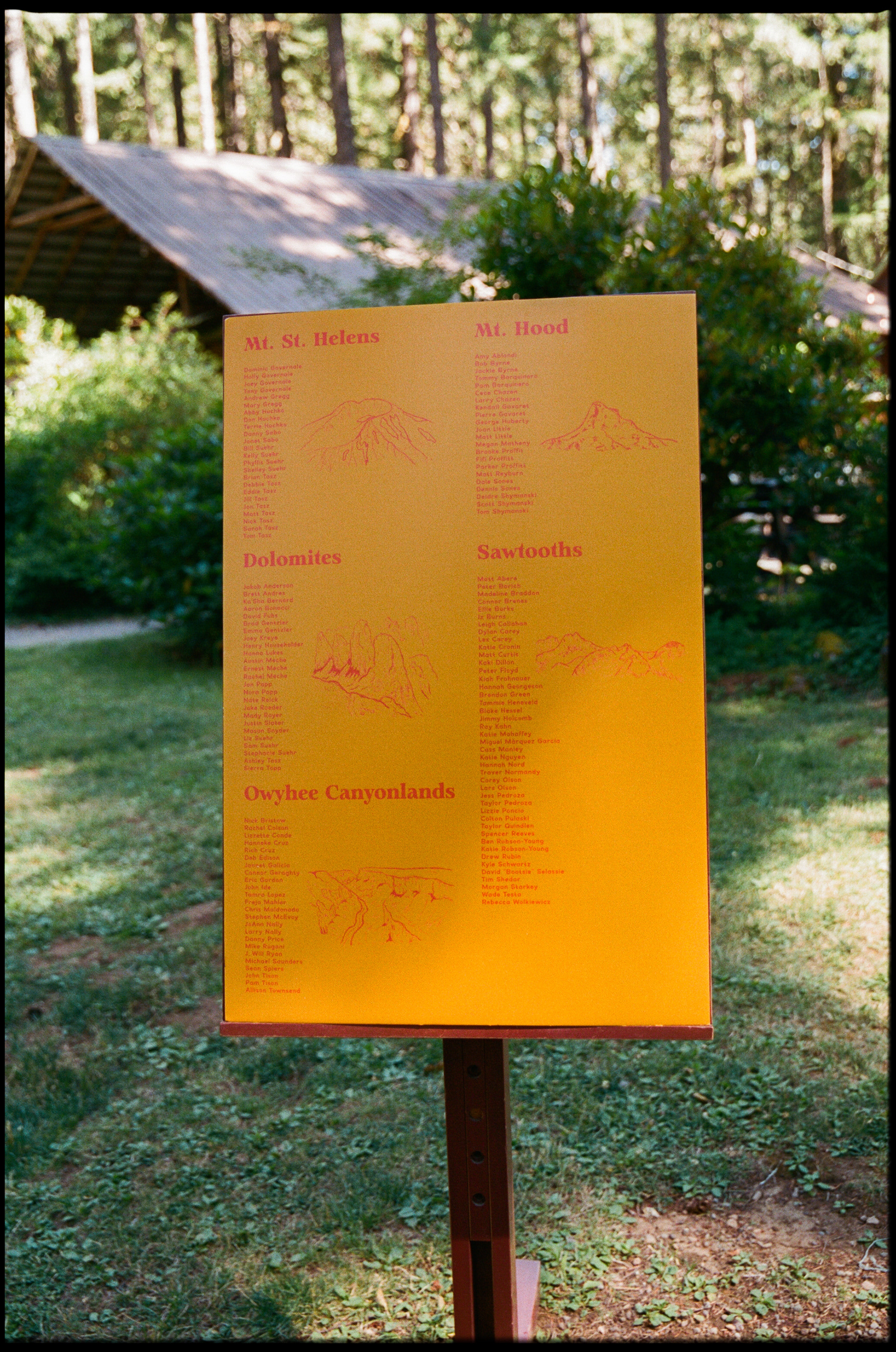
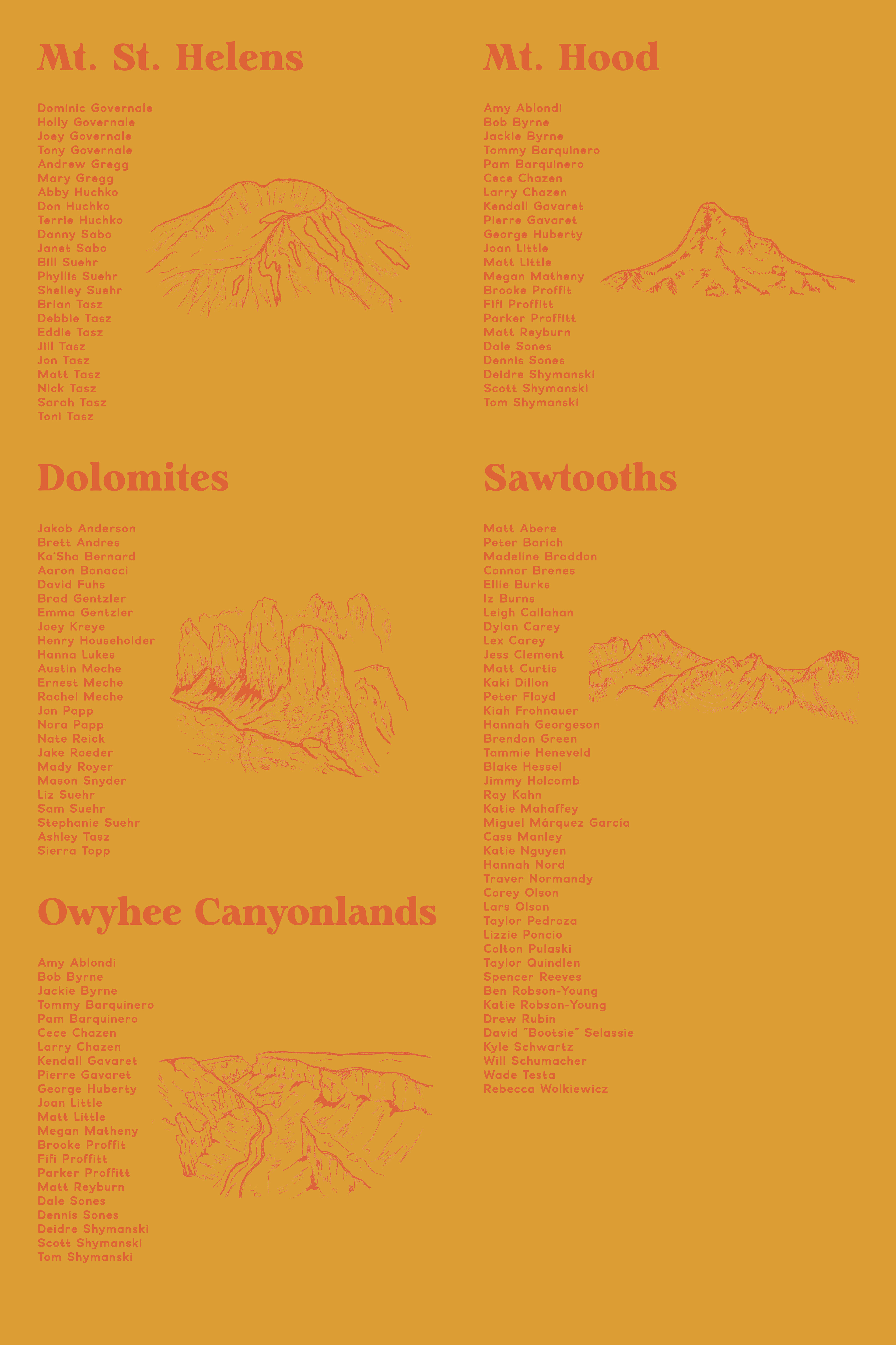
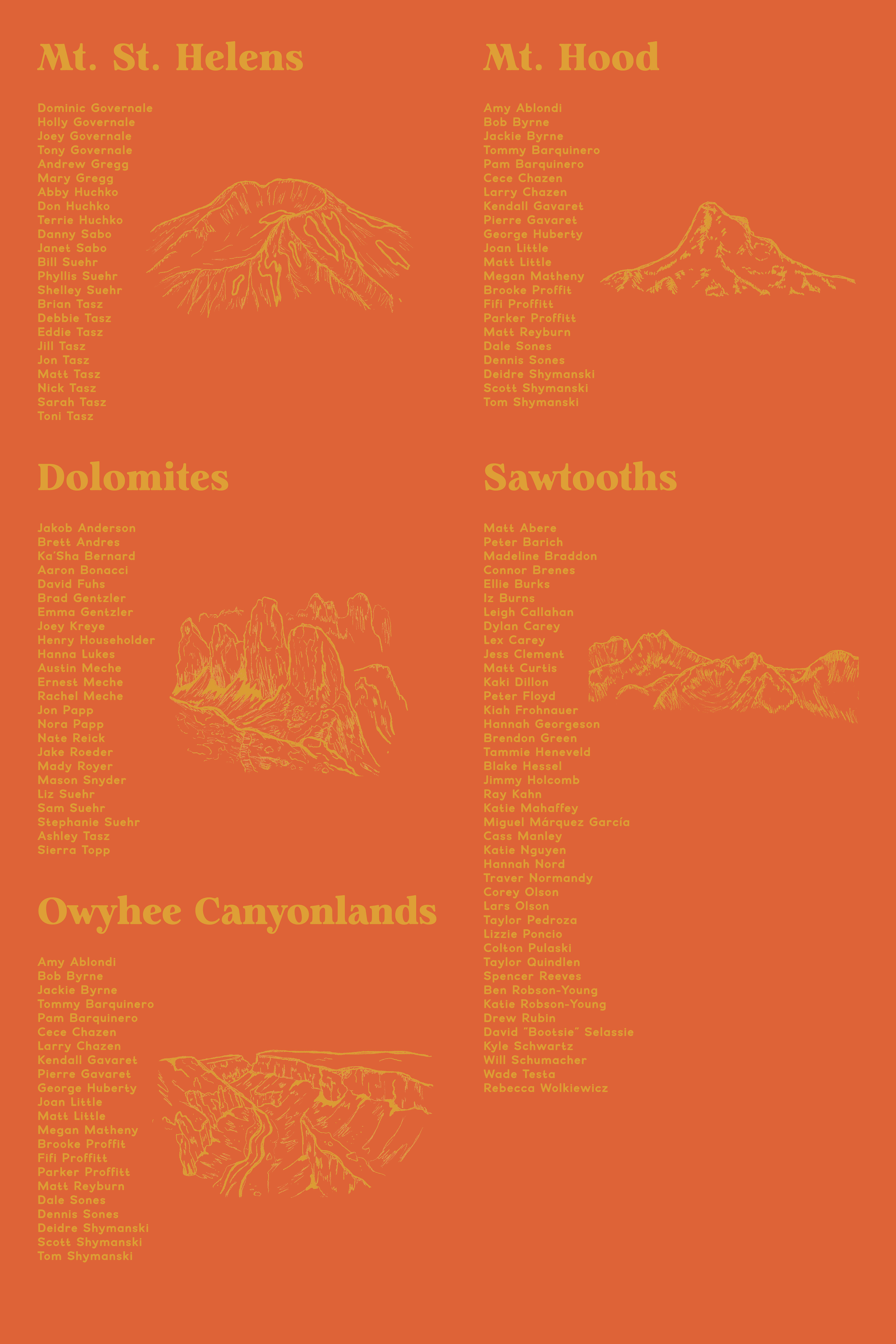
Tables + Seating Charts
Tables + Seating Charts
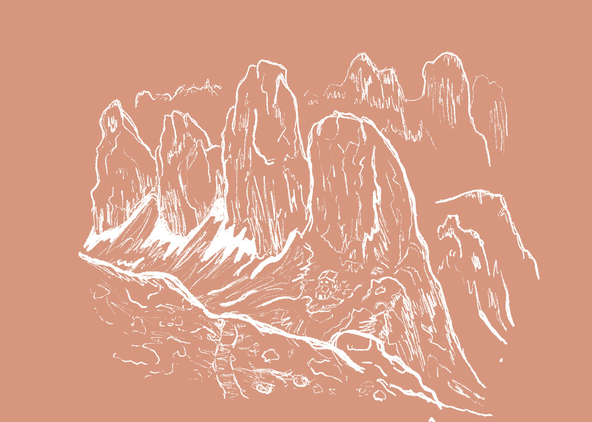
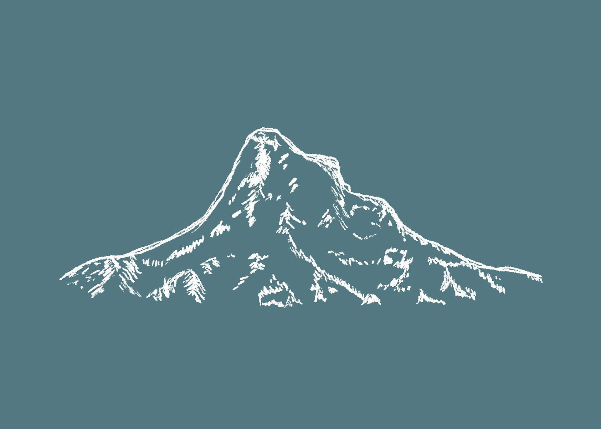
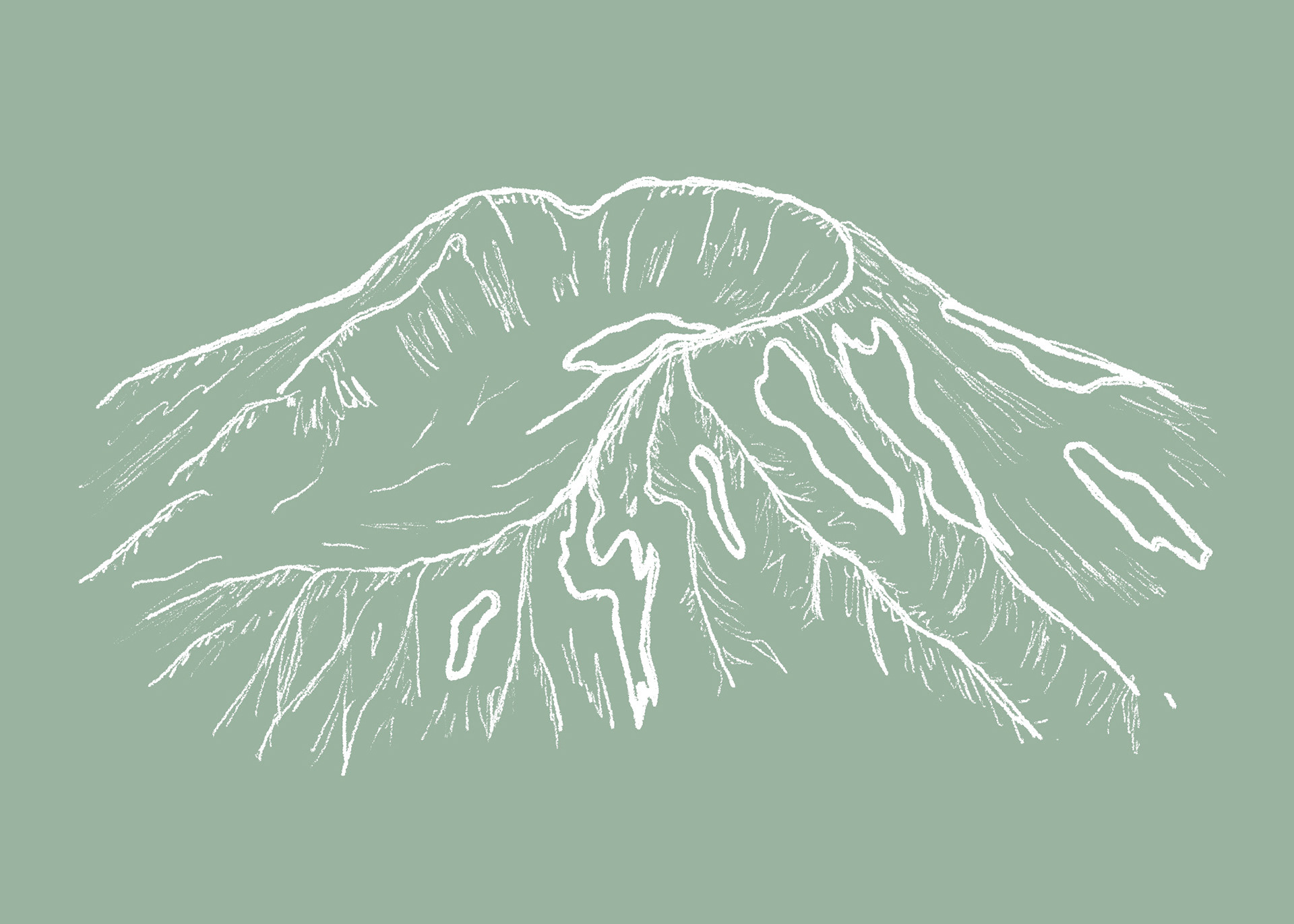
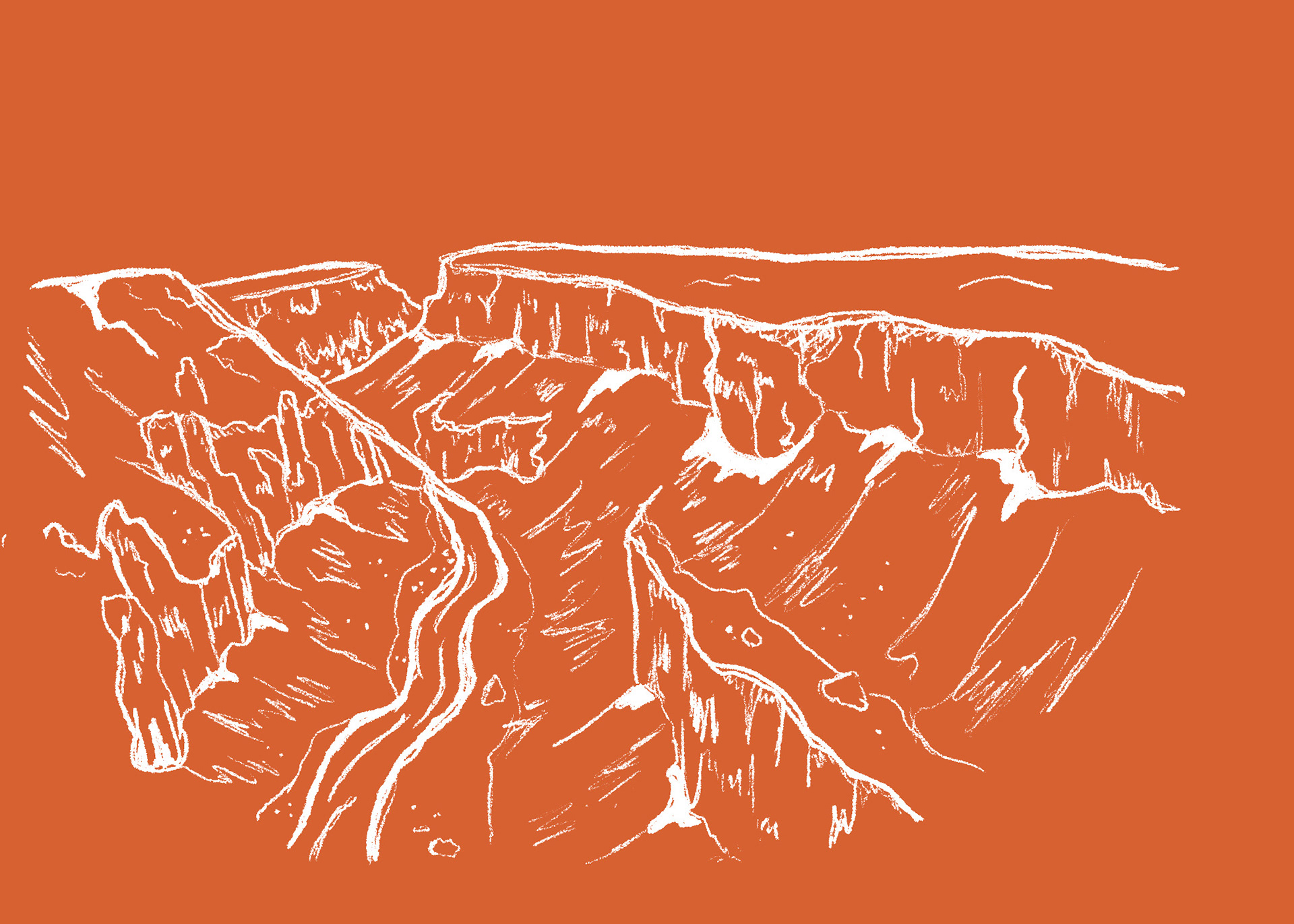
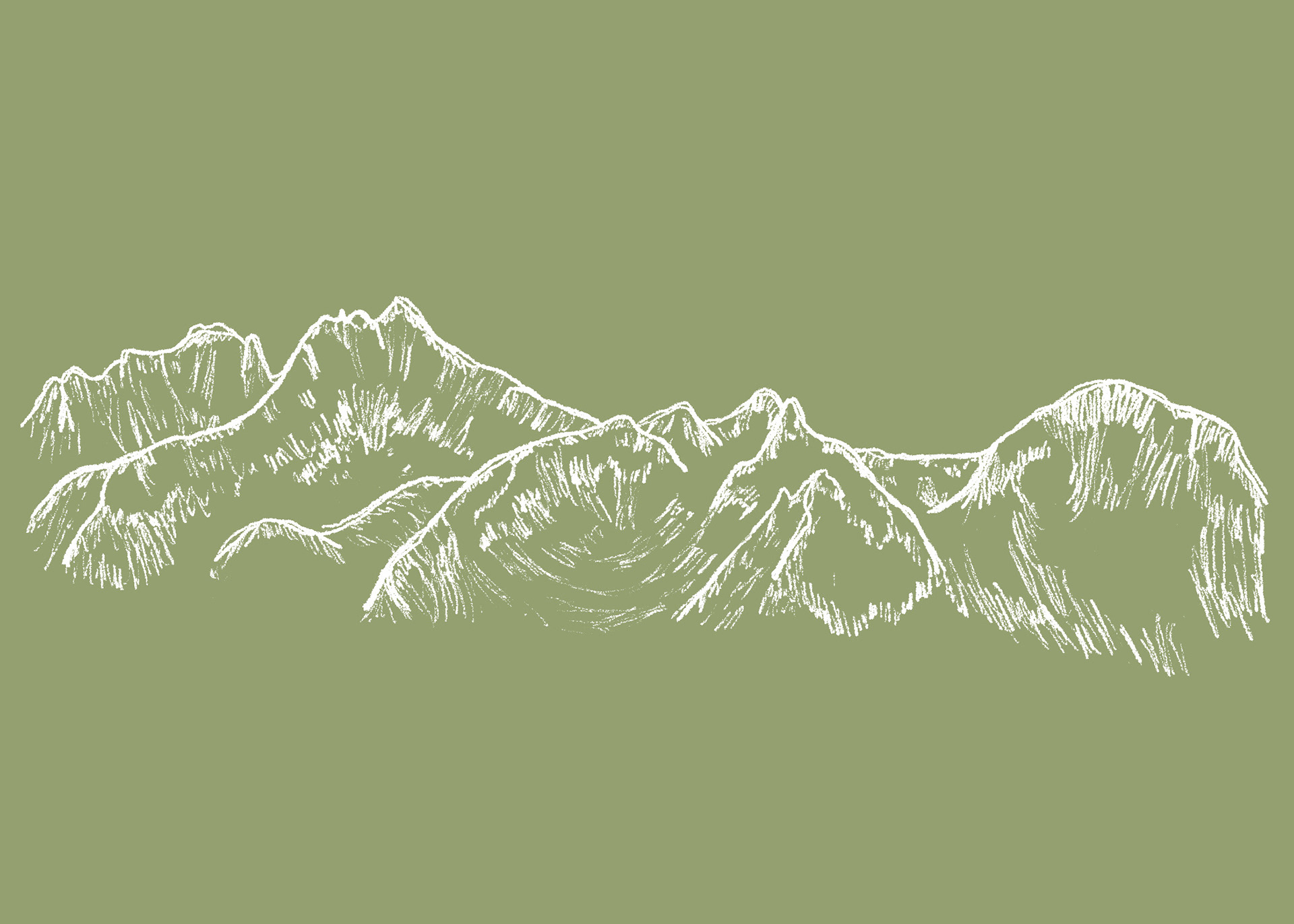
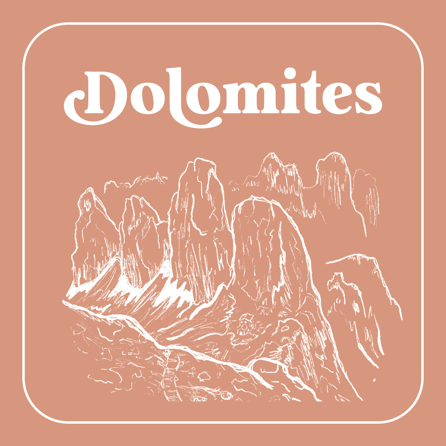
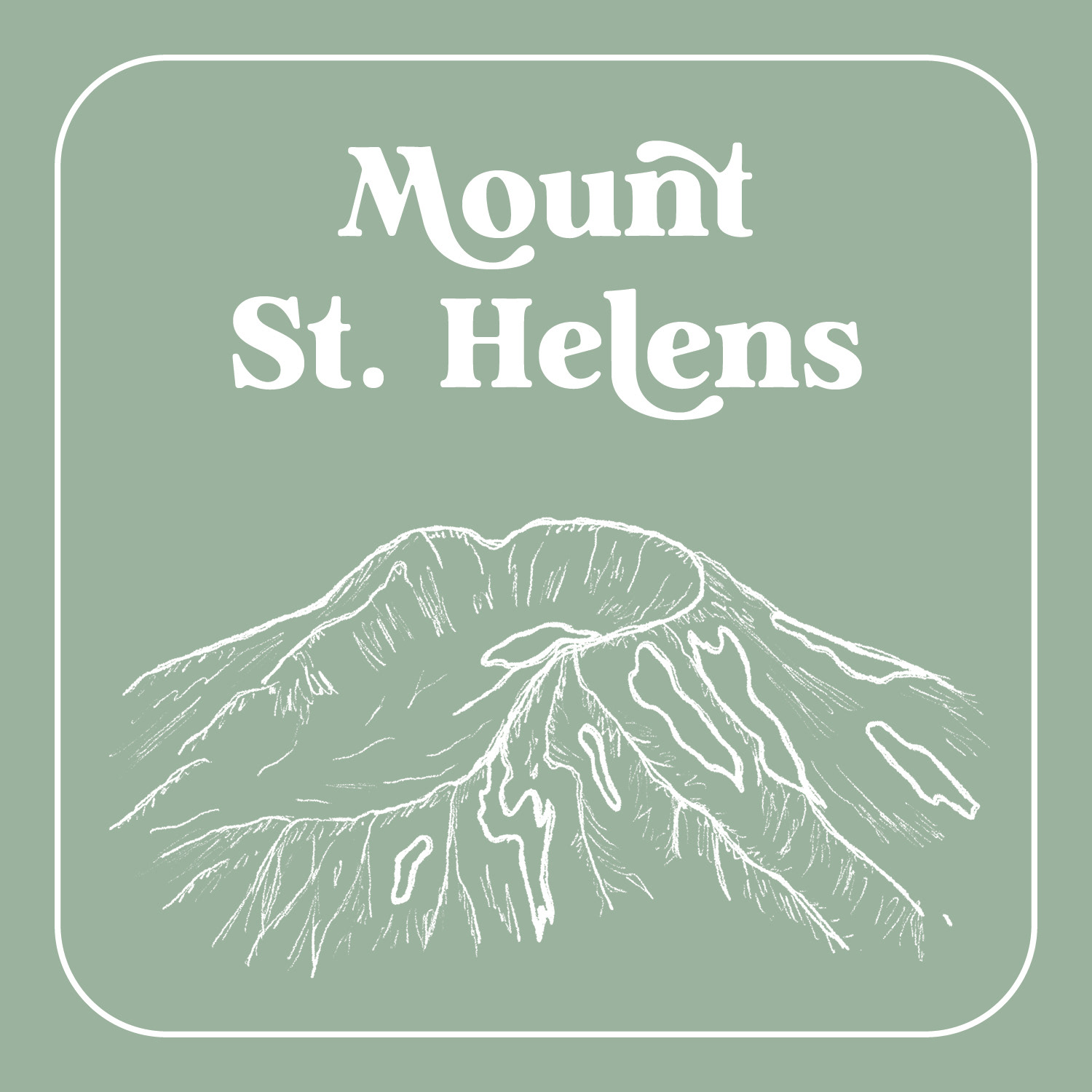
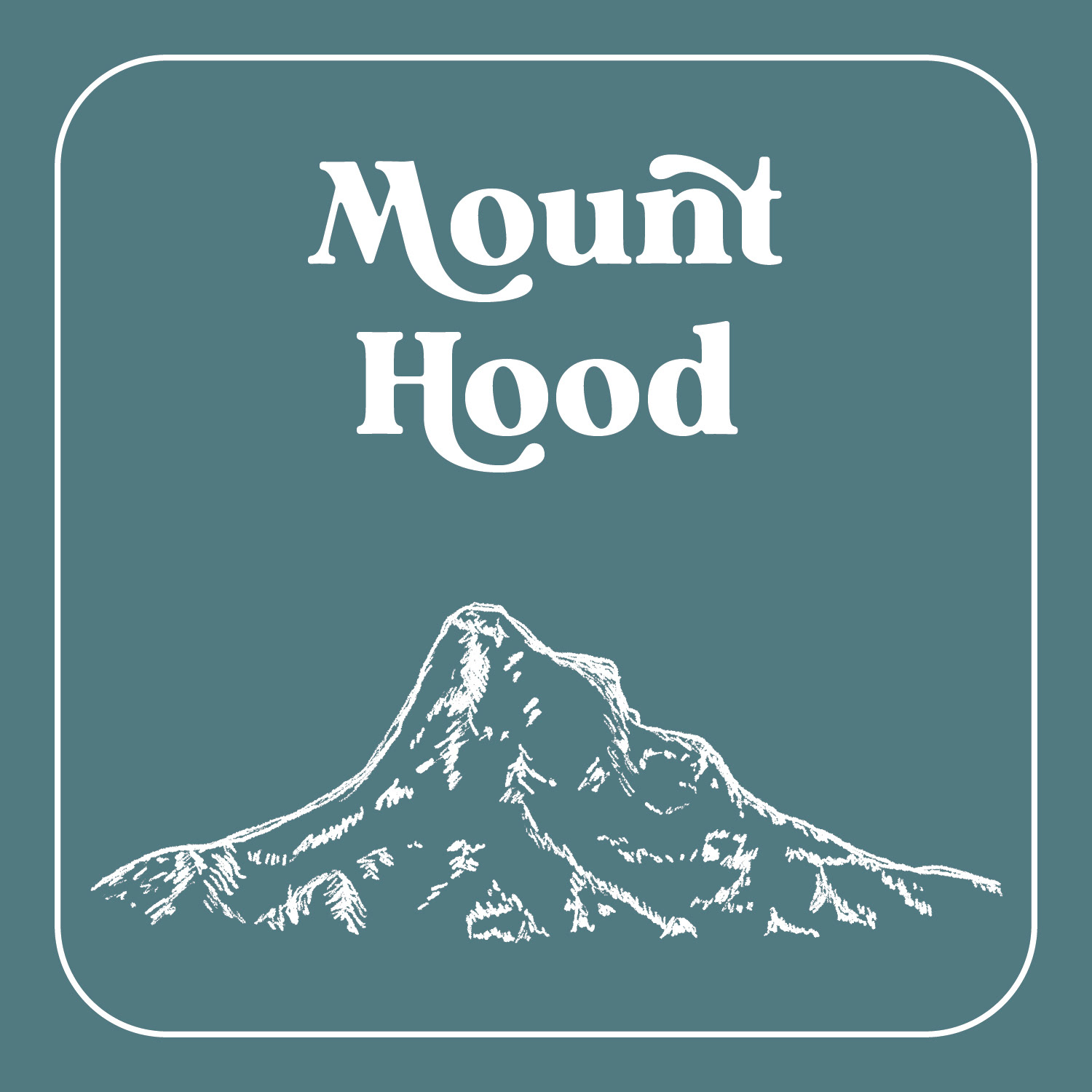
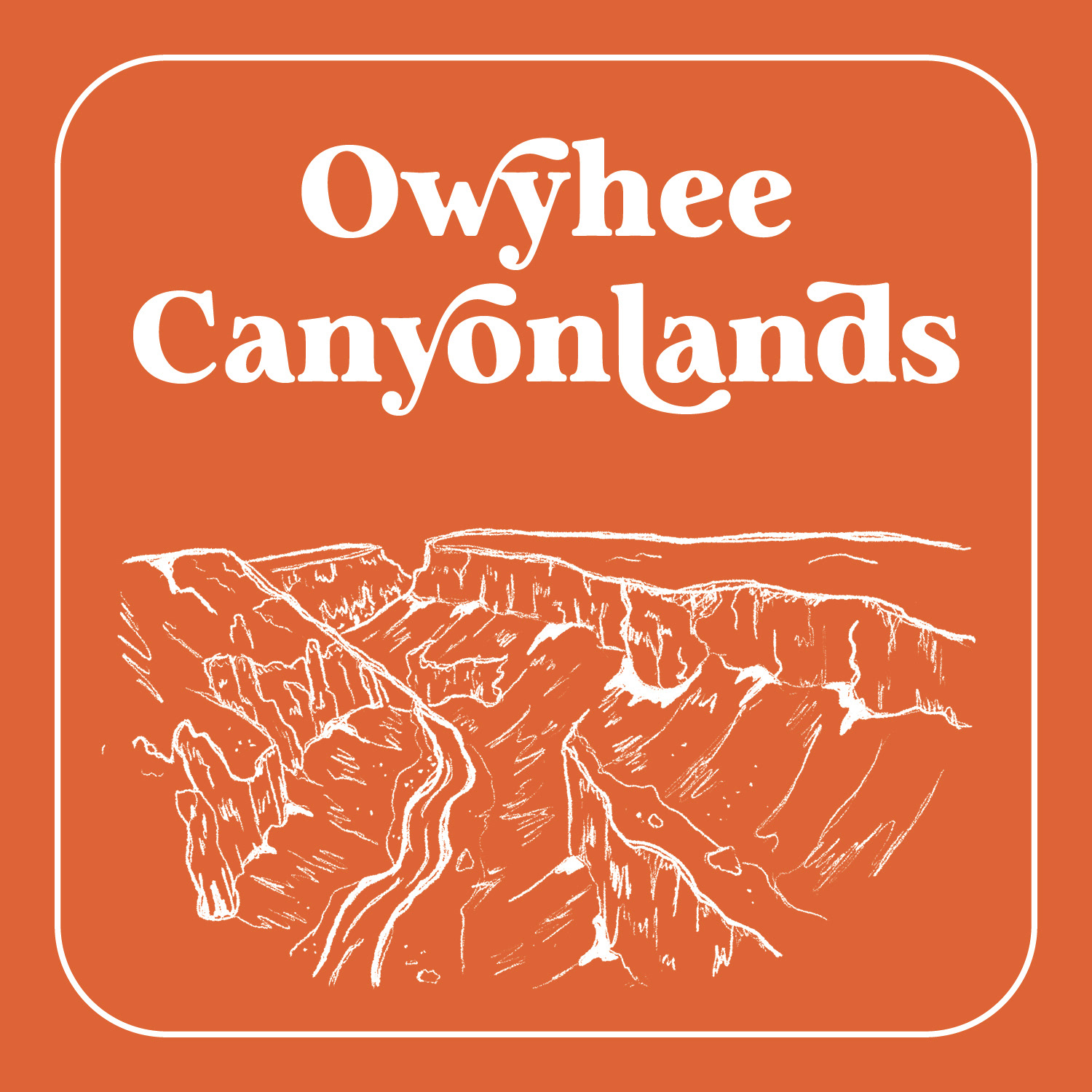
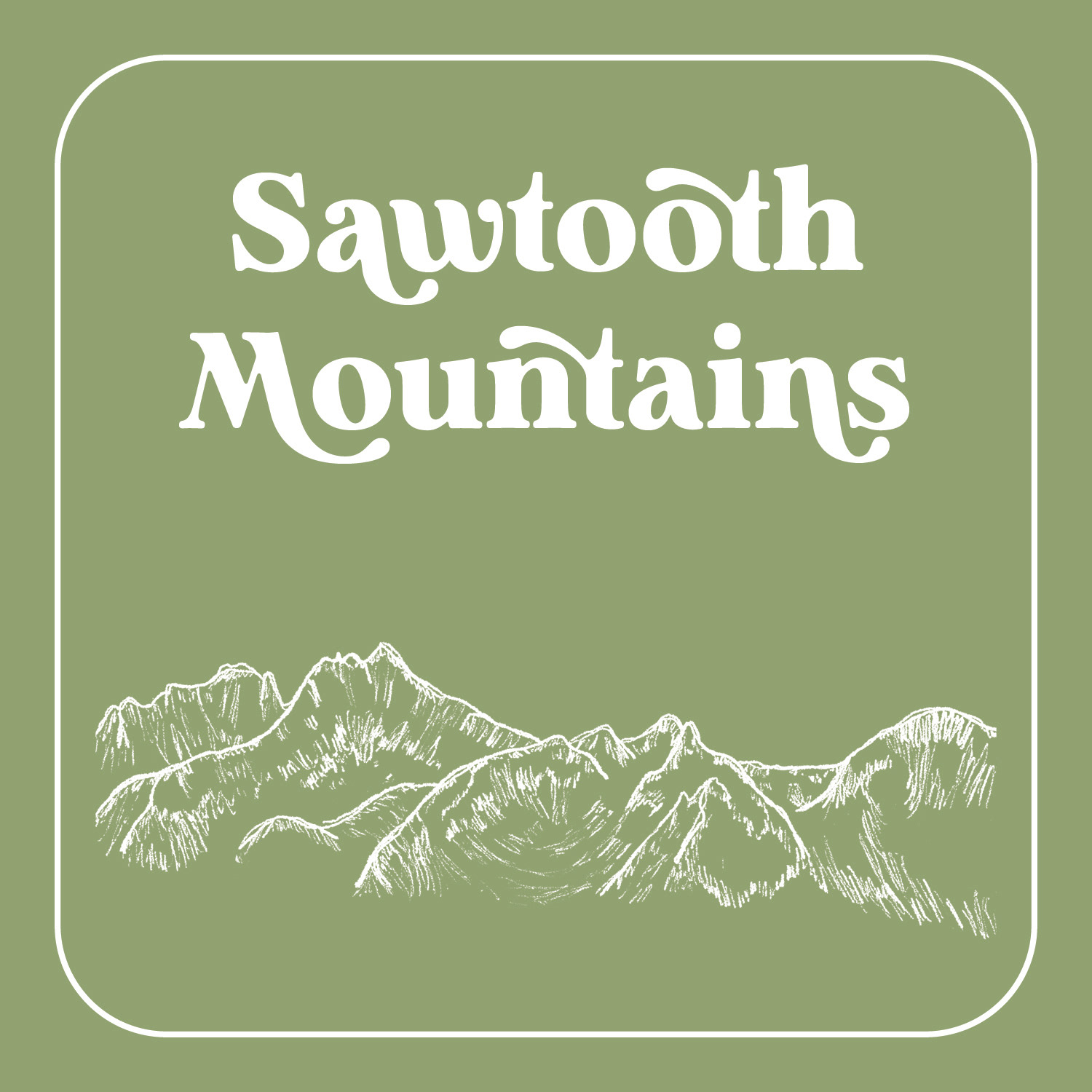
I was most excited to illustrate the outdoor places we'd been together, and how that could become personalized touch of our wedding landscape.
I illustrated the Dolomites (coral pink), Mt. Hood (dark blue), Mt. St. Helens (seafoam green), the Owyhee Canyonlands (orange), and the Sawtooth Mountains (moss green) for table settings and also seating charts.
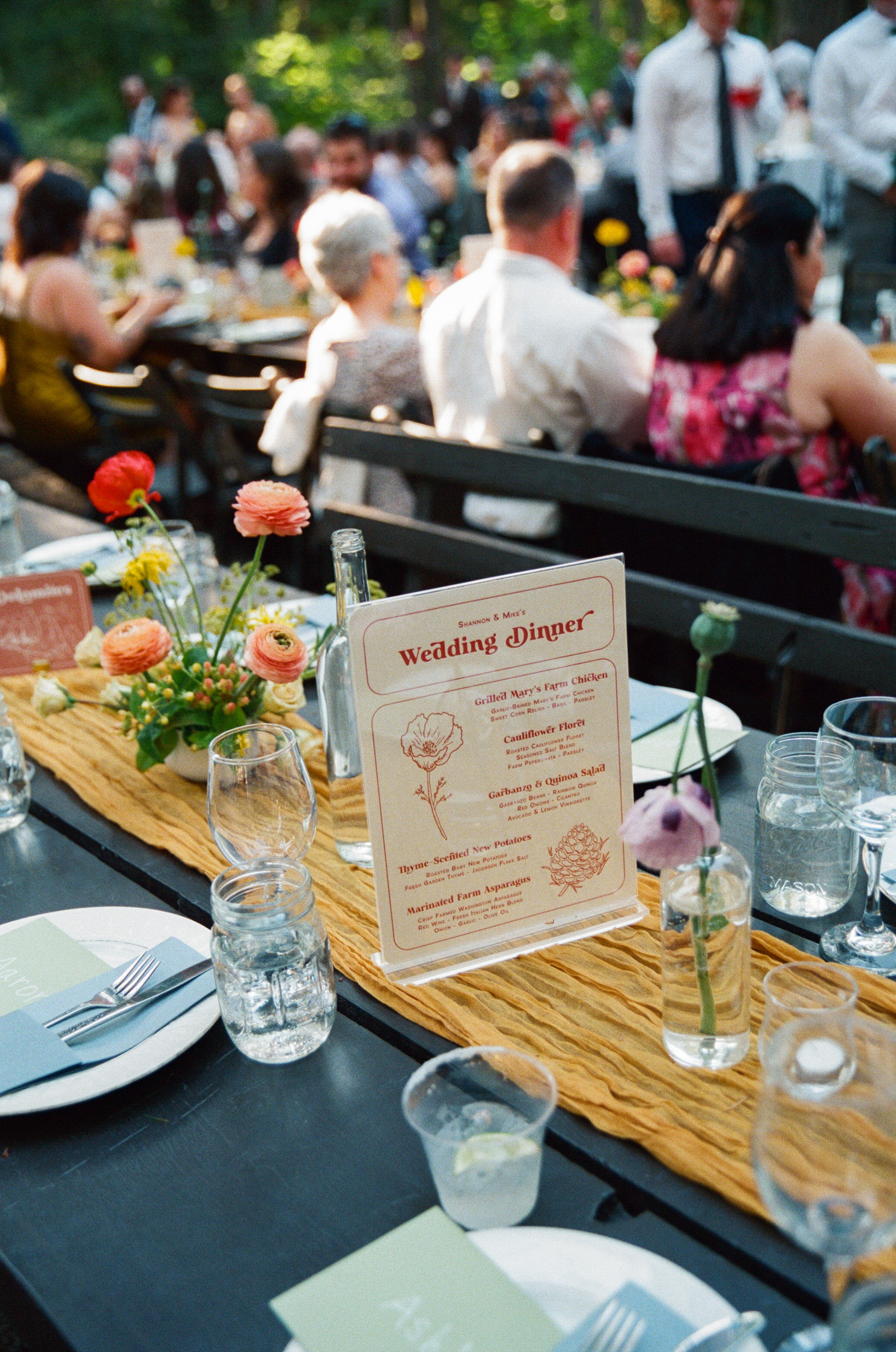
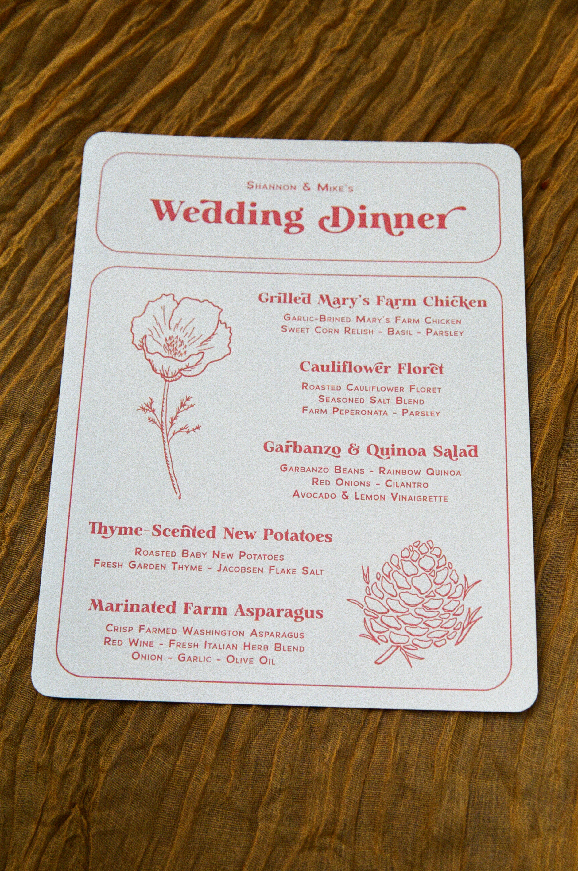
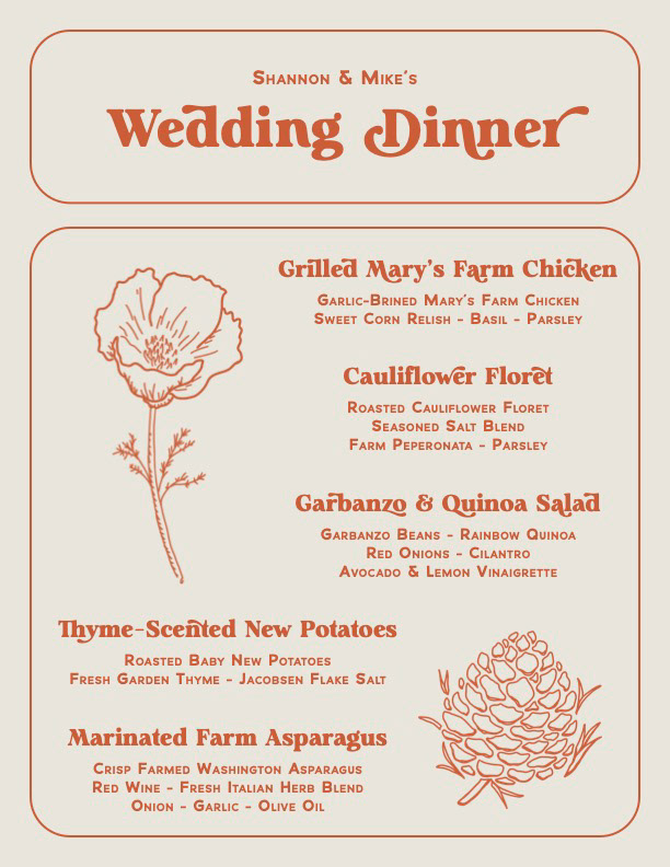
Menus
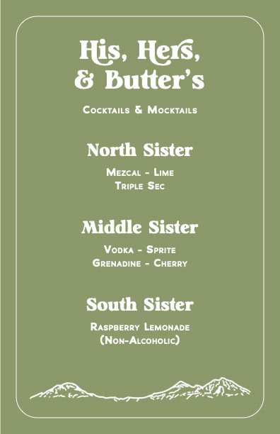
In recycling most assets, I created a cocktail menu around the Three Sisters mountains nearby and laid out a dinner menu to button up all the design and illustrations at our wedding.